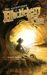
 I ordered a copy of IDW's The Adventures of Huckleberry Finn. The book arrived yesterday in the mail, and I'm greatly disappointed with this edition.
IDW's Huck Finn lacks ambition and imagination. IDW had an opportunity to publish an American classic. Instead, it feels like a lackluster money grab, taking advantage of a popular book in the public domain.
First, I want to talk about the absence of ambition. Eric Powell illustrated this Huck Finn, barely. I counted 21 interior illustrations. A 275 page novel, 43 chapters, and there's only 21 illustrations? For comparison, one of the earliest editions of Huck Finn features 174 illustrations. Eric Powell must be a busy person, but I would expect at least one illustration per chapter. After all, IDW is primarily a comic book publisher. It's surprising to see such a publisher use art so sparingly. Also, no serious design efforts were made with the interior. They copy-and-pasted the Word document with little thought to what was possible. The first letter of the each chapter is enlarged more out of tired obligation. Forget the wonderful tradition of finely designed dropped capitals. I will give them this, the text is clean and readable. (Additionally, I'm a little disappointed they omitted the chapter titles, but they aren't the first publisher to do this.)
Second, Huck Finn is a tremendous adventure story, highly imaginative. It's a shame IDW and Eric Powell weren't able to keep pace with Mark Twain. With the illustrations, Huck's face is often hidden from the reader. He is shrouded in shadows or completely in silhouette, sometimes his back is to reader or the image is from Huck's point of view. If this is a conscious artistic choice, it is the wrong one. Mark Twain shows us Huck on every page -- his thoughts, his voice, his life. To hide our protagonist is, at best, a failed gimmick and, at worst, it attempts to undermine Twain's efforts. The Duke and King earn Powell's attention more than Jim. We have one illustration of an uncharacteristically stoic Jim (has Powell read the book?) on his knees and then Jim fleeing from gunshots with Huck and Tom. There are so many opportunities to humanize both Huck and Jim. Powell avoids humanity and opts for the most bland approach. Some of these illustrations are "phoning it in" -- a pocket knife on page 6, Pap's boot print on page 21, close up of the axe on page 38, and the fish skeleton on the last page.
Eric Powell is a great artist. Unfortunately, we get so little from him. It's not fair to blame Powell though. He's the hired gun. IDW's HUCK FINN ultimately fails, because the editors Justin Eisinger and Alonzo Simon didn't ask for more.
And Huck deserves better.
