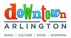
I realize it wasn't too long ago that I railed against the Dallas Maverick's hideous website (click here), but I must say a few words about the new signature logo for Downtown Arlington. I found out about this monstrosity on D Magazine's Frontburner blog.

Cringe.
Why do I keep complaining about bad design? I will answer this question with an even more important question: Why must things be ugly? I'm not kidding. Why? We have plenty of graphic artists capable of making the world a little more beautiful, more thoughtful, and more balanced. Instead, Arlington has dumped untold amounts of money (UPDATE: According to Star-Telelgram: "the corporation spent about $30,000 on the logo and branding campaign") to revive the downtown--and they blew the most basic component. Get an appealing logo. Great logos are hard, but good logos aren't. I would be happy with "good."
Instead, we have something that looks like it was designed by a City Council member's teenage son. (That was April's assessment.) I don't know who the designer is, but they are merciful to keep the name(s) a secret.
The logo is not "fun." It's goofy. It's embarrassing and, yes, contrived.
I wrote about Downtown Arlington earlier this year in D Magazine (click here). My main point was that Arlington is trying really, really hard to be cool, and the city isn't quite there yet. When I saw this logo, I think Arlington took a few more steps back. And that's unfortunate, because there's a lot to brag about in downtown.
It's even more unfortunate when you consider that Advertising Age magazine honored (?) Arlington on its "Worst of Tourism Marketing" list for the slogan, "And the crowd goes wild." Arlington just cannot catch a break.
Arlington should heed the words of Cameron from the TV show MODERN FAMILY when he said, "You're not making the compelling case you think you are." So true.
Anyone else want to heap insults onto this logo? Feel free to post in the comments section.
